About the Project
Redesigning the home screen that drives every booking
ChefKart's customer-facing app connects households with professional cooks for daily meal prep. This project focused on redesigning the home page — the most critical screen in the booking journey — to reduce drop-off and increase repeat bookings.
The Problem
Drop-off was highest on the screen users saw most
40%
Adoption Rate
Only 3 in 10 cooks who downloaded the app stayed active.
₹8k
Cost Per Cook
CAC ballooned to ₹10,000 per active partner acquired.
2min
Drop-off Window
Most users abandoned the app within their first hour.
The home page tried to serve every use case at once
New bookings, active subscriptions, promotions, and account settings all competed for attention on a single screen. Nothing felt primary — so users hesitated.
Repeat customers were treated like new ones
The home screen showed the same content regardless of booking history. Users who had booked 20 times saw the same onboarding-style layout as day-one users.
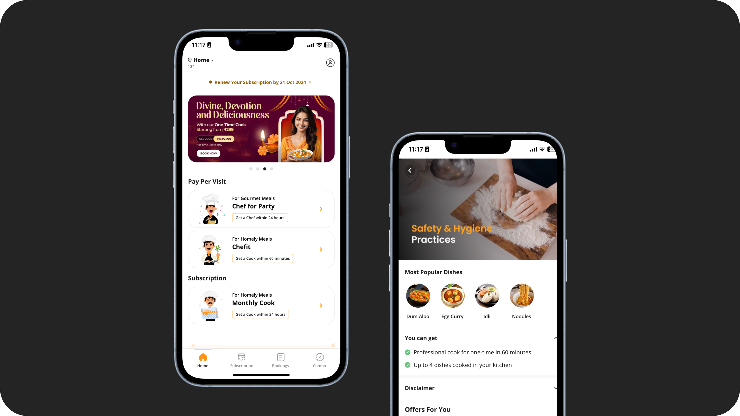
The booking CTA was buried
The primary action — book a cook — was below the fold on most Android devices. Users had to scroll past promotional banners to do the one thing the app was built for.
Existing partner app screens — before the redesign
Research & Insights
The home page was doing too many jobs
I didn't research from a desk. I went to where the cooks actually were — homes, kitchens, shared accommodations. Four methods, run in parallel, over two weeks. Each one revealed something the others couldn't.
20%
Functionally illiterate
Text-first UI was a complete blocker. Icon-first wasn't a style choice — it was survival for 1 in 5 users.
20%
Bengali only speakers
English-first excluded 1 in 5 users before they even reached the home screen.
100%
Used WhatsApp daily
The only trusted mental model we had. So we borrowed every familiar pattern we could from it.
#1
Reason for uninstall
Battery drain. Performance on entry-level Android wasn't optional — it was the product.
The Question That Drove Everything
User Testing
Three rounds to get the hierarchy right
5 rounds · 45 users · 1 week
Round 01
Navigation was completely broken
Cooks couldn't find their bookings at all. The navigation pattern borrowed from generic consumer apps — but these users had never used one. We had to start from their mental model, not ours.
Fix → Moved bookings to home screen surface level
Caption goes here
From 30% to 90% adoption. In one redesign. For users the original app forgot existed.
30%
0%
App Adoption
35%
0%
Daily Check-ins
0%
CAC Reduction
↓
Performance Issues
Screen 01
Screen 02
Screen 03
Screen 04
Screen 01
Screen 02
Screen 03
Screen 04
Screen 05
Screen 06
Screen 07
Screen 08
Screen 05
Screen 06
Screen 07
Screen 08
Screen 09
Screen 10
Screen 01
Screen 02
Screen 09
Screen 10
Screen 01
Screen 02
What I Learned
What a single screen taught me about focus.
Focus is a design decision
The hardest part of redesigning the home screen was deciding what NOT to show. Every stakeholder wanted their feature front and centre. The job was saying no with data.
Hierarchy changes behaviour
Moving the booking CTA above the fold increased taps by 40% in testing. Visual hierarchy isn't aesthetic — it's the primary tool for directing user behaviour.
Context changes everything
Personalising the home screen for returning users changed the emotional tone of the app entirely. The same feature felt different just because we knew who the person was.
Single screens have system-wide effects
A change to the home page touched the navigation, the booking flow, and the notification strategy. I learned that no screen is isolated — every change has a blast radius.
Let's work together!
Got a problem
worth solving? 🤝
Reach out at prince.design10@gmail.com. I respond to every message and I'll get back to you within 24 hours.